
Using Special Characters on LinkedIn: How to Stand Out Without Looking Unprofessional
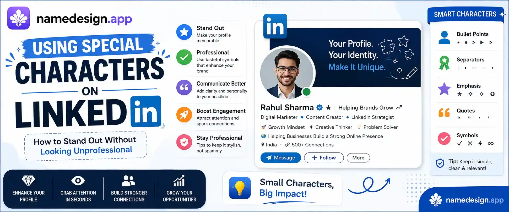
Table of Contents
Scroll through your LinkedIn feed right now, and you will likely notice a sea of absolute sameness. Everyone has a nearly identical job title setup, the exact same system font layout, and the same rigid, buttoned-up approach to text formatting. It makes total sense—LinkedIn is a professional networking site, and no one wants to risk looking childish or missing out on a career opportunity because their profile looks too casual.
However, because everyone is following the exact same corporate handbook, standing out to a busy recruiter or a potential client has become harder than ever. When a hiring manager looks at a list of fifty "Software Engineers" or "Content Marketers," their eyes glaze over. They need a visual anchor to make them pause.
This is where smart personal branding comes into play. By using subtle custom typography and professional Unicode formatting from NameDesign.app, you can break up the monotony of the standard LinkedIn layout. But unlike writing an Instagram bio or a gaming tag, formatting a business profile requires absolute precision. One wrong move, and you go from looking like an innovative industry expert to looking completely unprofessional.
Let's map out the rules for adding custom text to LinkedIn safely, ensuring your profile stays executive-friendly while commanding attention.
The LinkedIn Dilemma: Corporate vs. Memorable
The core purpose of design is to direct attention. On a platform like LinkedIn, your layout needs to guide a visitor's eyes straight to your biggest career wins, your business offers, or your newsletter links. If your text is just a massive block of standard paragraph text, most busy professionals will simply skip past it.
Custom Unicode elements let you introduce hierarchy. Think of custom text as a digital highlighter tool. When used correctly on key phrases, a bold serif font or a clean set of brackets can elevate a boring bio line into a striking, publication-grade layout. The goal is not to turn your profile into a colorful art piece; the goal is to make your professional summary cleaner and easier to read.
The Search and Accessibility Trap
Before you copy anything onto your profile, you need to understand how LinkedIn's search engine processes custom text. Like all platforms, LinkedIn runs on algorithmic keywords. When a corporate recruiter types "Project Manager" into their recruiter panel, the platform scans millions of profiles for that exact string of letters.
As we covered in previous guides, custom copy-and-paste text generators work by using Unicode symbols that look like stylized English letters. While a human eye reads a bold serif word perfectly, LinkedIn’s search indexing software might read it as a string of mathematical symbols.
Never convert your primary job titles or core skills into a custom font. If you change your main title to a fancy text variation, you will instantly disappear from recruiter search queries. Keep your core keywords standard, and save the custom styling strictly for emotional hooks, metrics, and call-to-actions.
Furthermore, professionals who rely on built-in desktop screen readers can struggle with heavily modified fonts, as the reader will spell out each symbol code rather than reading the word naturally. To maintain full accessibility, keep your custom typography limited to single words or brief section tags.
Safe and Executive-Approved Text Styles
So, which text styles actually pass the corporate vibe check? You want to stay completely away from styles like Box Text, script cursive, or anything labeled as glitchy or decorative. Instead, stick to these two clean, highly legible styles:
The Professional Bold Serif
This style ( 𝐁𝐨𝐥𝐝 𝐒𝐞𝐫𝐢𝐟 ) mimics the traditional editorial typography found in high-end business journals like Forbes or the Harvard Business Review. It looks solid, official, and authoritative. It is the best choice for emphasizing impressive metrics (e.g., 𝟔𝟓% 𝐑𝐎𝐈 or 𝟓+ 𝐘𝐞𝐚𝐫𝐬 𝐄𝐱𝐩𝐞𝐫𝐢𝐞𝐧𝐜𝐞) inside your headline or about summary. You can grab this instantly using our Bold Text Generator.
The Elegant Italic
Standard LinkedIn text doesn't let you italicize words. By using a clean Unicode italic style ( 𝘚𝘢𝘧𝘦 𝘐𝘵𝘢𝘭𝘪𝘤 ), you can add emphasis to book titles, company taglines, or personal quotes without cluttering the screen. It creates a subtle, intellectual shift in your sentence structure. Try it out on our Italic Text Generator.
Formatting Rules for Profiles and Articles
Let's map out exactly where and how to integrate these elements into your LinkedIn architecture for maximum effect.
Your Profile Headline
Your headline follows you everywhere you comment or post on the app. Instead of writing "CEO at Company Name," try using a stylized text breaker or a bold metric to draw the eye down to your profile when you drop insights on industry posts.
Example: Sales Director | Helping SaaS startups scale from 𝟎 𝐭𝐨 𝟏𝟎𝐌+ in revenue 🚀
The "About" Section Headers
Most LinkedIn users leave their About section as a massive block of unreadable text. By using bold serif words as structured subheadings, you create a beautiful, scannable resume. Use a character from our Blank Text tool to create clean margins, then create clear headers like:
- ✦ 𝐌𝐘 𝐄𝐗𝐏𝐄𝐑𝐓𝐈𝐒𝐄
- ✦ 𝐂𝐀𝐑𝐄𝐄𝐑 𝐌𝐈𝐋𝐄𝐒𝐓𝐎𝐍𝐄𝐒
- ✦ 𝐇𝐎𝐖 𝐖𝐄 𝐂𝐀𝐍 𝐖𝐎𝐑𝐊 𝐓𝐎𝐆𝐄𝐓𝐇𝐄𝐑
The Ultimate Professional Typography Blueprint
To keep things crystal clear, use this quick layout guide before finalizing any updates to your professional personal brand.
| What to Do (Professional) | What to Avoid (Unprofessional) |
|---|---|
| Use bold text strictly for numbers, metrics, and short section headers. | Converting full sentences or paragraphs into custom fonts. |
| Use monochrome, elegant symbols like ✦, ⌖, or ❘ as clean layout splitters. | Using bright, neon emojis at the start of every single line. |
| Keep your official search name and primary title in default plain text. | Using decorative text formats like fancy graphics in your searchable name. |
| Use clean italics to highlight quotes, testimonials, or media features. | Using chaotic styles like Zalgo or glitch text anywhere on your page. |
At the end of the day, LinkedIn rewards professionals who take their personal brand seriously. By using custom text with restraint and intention, you show that you care about execution, presentation, and clarity. Head over to our homepage, find a clean bold or italic style, and give your career profile the premium look it deserves.